“I felt I wanted my children, and my children’s children, to look at this work and think "what can we do?". This work can be read on many levels, but on one level it’s about what it takes to achieve something impossible as human beings…”
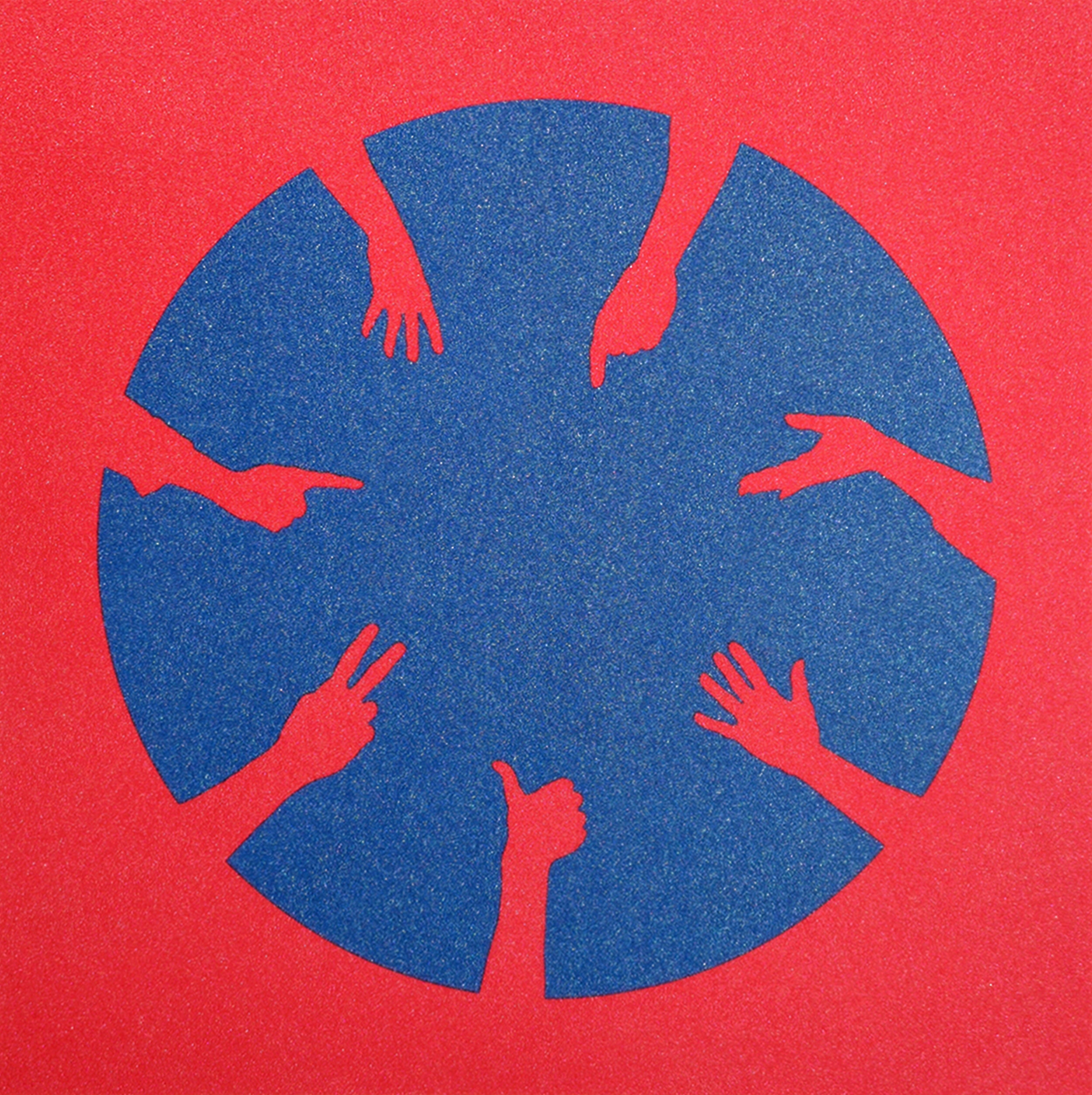
Unity I, 2020 Two-colour silkscreen print with water-based pearlescent ink on Somerset white cotton paper 400gsm, H35 x W33cm , Edition of 25
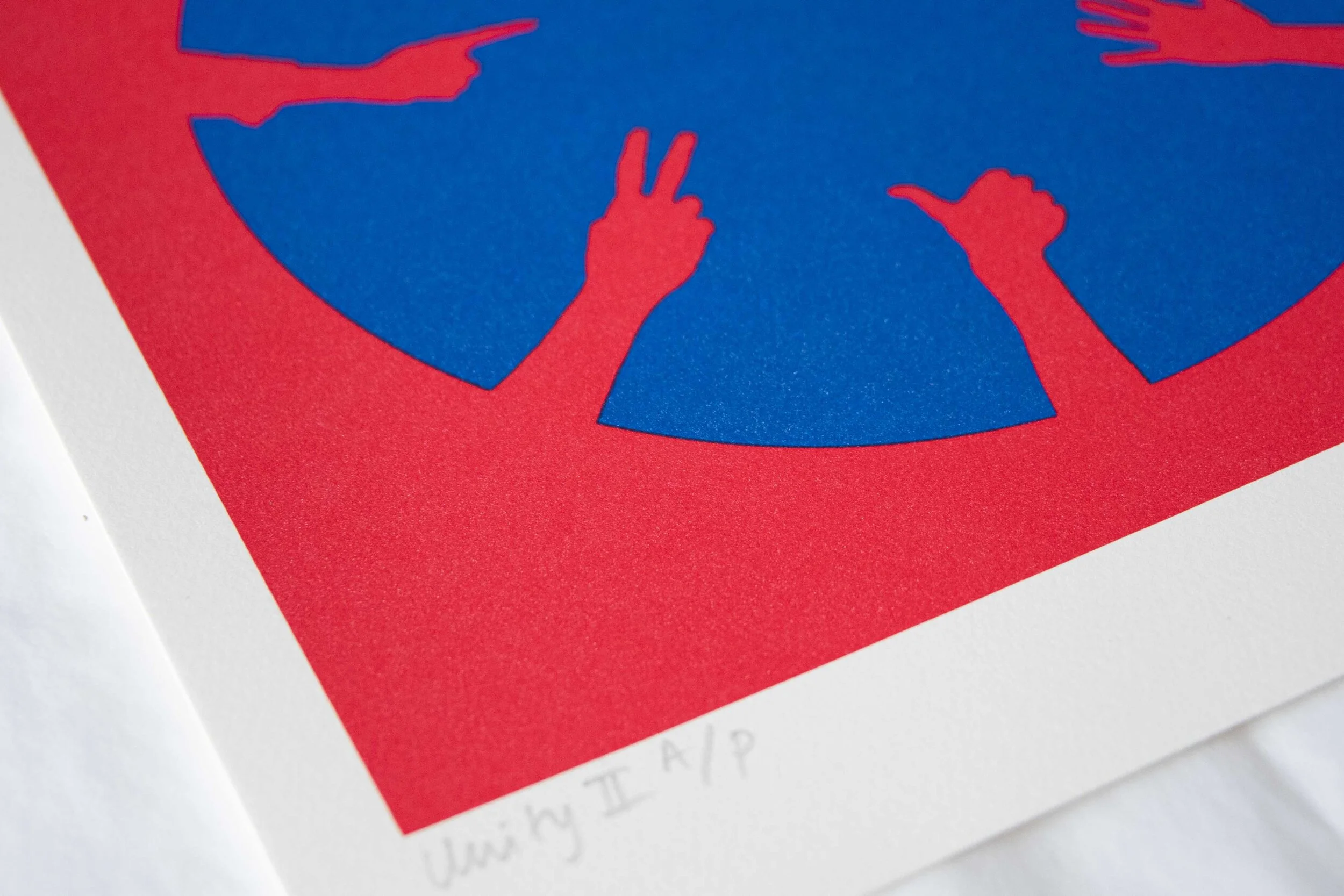
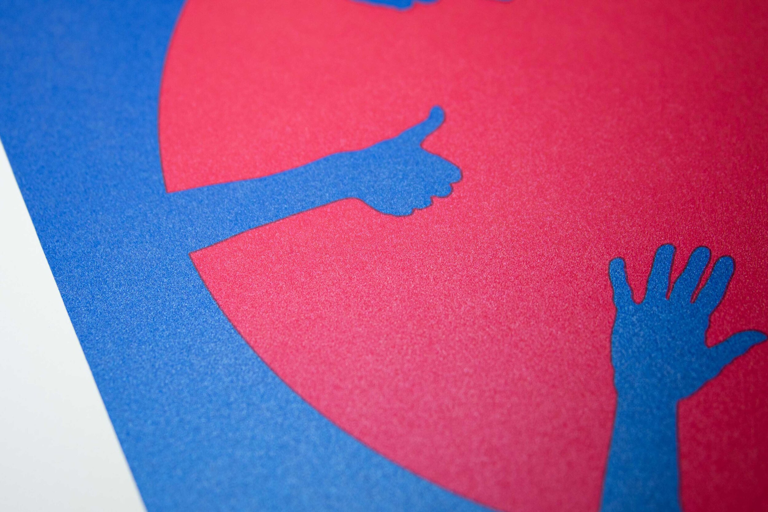
Unity II, 2020 Two-colour silkscreen print with water-based pearlescent ink on Somerset white cotton paper 400gsm, H35 x W33cm , Edition of 25
Unity I and II are limited edition silkscreen prints created to mark the inauguration of President Biden, and were launched alongside my solo exhibition at Zuleika Gallery, Oxford titled 'Nicola Green - Unity'.
These artworks reference a particular moment in American politics, but they also embody an important global message, pertinent to everyone. In our increasingly fractured times, shaped by partisan politics and deep divisions in almost every society, this work is a consideration of how people can reconcile their opposing views and a reminder that when people come together they can achieve the seemingly impossible.
The iconography seen in these pieces is derived from Day 1, Light from my series In Seven Days…
I created this symbol of the seven hands, with different gestures, united in a circle of light. It is a powerful example of how non-verbal gestures often embody or communicate so much more than words. You can find out more about this symbol, and the iconography of the entire series here.
In Seven Days...was about capturing a specific moment in time. I wanted to witness Obama’s election on behalf of my mixed heritage children, and their generation, who were too young to watch it for themselves. To document it and understand what it might mean for them.
I realised to truly understand this moment, I had to start by looking backwards. This image is the beginning of that story and it represents the long arc of history. It refers to the story of creation when light was made from, and out of, darkness. More literally, it was inspired by the Democratic National Convention which took place on the 28th August, 2008. This was not only the day President Obama accepted the Democratic nomination, but also the anniversary of the UK Slavery Abolition Act in 1833 and Martin Luther King's "I Have a Dream" speech in 1963. I wanted to reflect on the idea that meaningful change takes generations.
With recent events raising so many questions in people’s minds, this is a moment to sit and reflect on these themes. The true impact of Obama’s election and his presidency for the next generation around the world is still being revealed.
With these two new works, I hope to reflect and commemorate the notion of unity, as well as how we hope to continue inspiring generation after generation.
I was so lucky to speak with Renee B. Adams Professor of Finance at the Said Business School, Oxford University.
Renee is an expert on gender research and corporate governance. Much of her work explores the role of gender in leadership, and we first met at a lecture I gave about my work Encounters and we had a fascinating discussion of the lack of female religious leaders in most faiths, around the world.
This conversation was recorded as part of the launch of Nicola Green: Unity at Zuleika Gallery. We discussed the role of race, gender, legacy, heritage, and identity in my work as well as the importance of visual images as a tool for research.
You can see a full transcript of this conversation on the Zuleika Gallery Website.
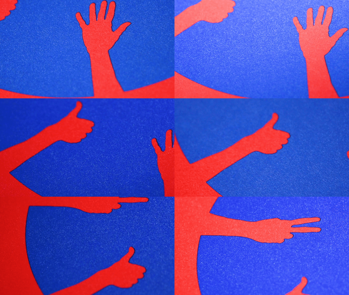
I spent a long time mixing the colours in these two pieces, trying to strike the perfect balance of tone and hue, so that the red and blue would be in harmony.
I chose to reimagine the Circle of Hands design in patriotic red, white and blue because it is synonymous with the United States, emblematic of pride, freedom, heritage, liberty and justice, but also with many other flags from around the world including the Union Jack. Red and blue are, of course, also the colours of the two main political parties in both the UK and the US.
In the UK red is used by the Labour Party because of its long association with the worker’s movement. Historically, the Conservative Party used blue, but it wasn’t formally adopted until 1949. In fact, the standardized red and blue really came in with the rise of colour television. Prior to this different colours were used based on local politics, including the interests of the landed gentry, civil war and Empire, for example, the use of green to express support for Irish home rule.
In the United States, the red-blue binary is even more recent. I was surprised to discover that the party colours were only established during the election between Bush and Gore 2000. As such a contested and divisive election with media coverage lasting for months, the news outlets agreed to use blue for the incumbent Democrats and red for the challenging Republican Party to avoid confusion. This understanding of blue and red states has now become totally entrenched in American politics.
Building on this, I became really interested in how we visually perceive colours and all of the feelings, thoughts and emotions they can invoke. I experimented with the relationship between different colours and explored the phenomenon of chromostereopsis - the way in which two colours placed next to one another can create an illusion of depth. All colours have spatial relationships to each other, and different combinations of red and blue can almost vibrate off each other. This creates an unsettling effect, which strictly speaking in design terms should be avoided. However, artistically this effect can be harnessed so that the piece radiates emotion and spiritual vibrations. This artistic use of vibration was pioneered by Mark Rothko, who famously used vast expanses of vibrating colour to express complex human emotions.
I wanted to ensure the colours in unity vibrated in this way, but at the same time, as such politically loaded colours I didn’t want the blue and red to compete with each other. I wanted them to work together harmoniously as a metaphor for the way in which people can hold their differences but still come together in unity.
Whilst watching President Biden’s inauguration I was struck by the sea of purple in the audience, worn by Kamala Harris, Hilary Clinton and Michelle Obama amongst others. It was a powerfully symbolic gesture, the purple was the perfect bipartisan tint as the mixture of Republican red and Democratic blue. This inspired me to add a little red to the blue, and vice versa, not enough to turn it purple, but enough to create the sense of emotion and harmony I was looking for.
If you are interested in purchasing any of the works featured in this post, please do take a look at my online viewing room.


